Kenya's internet landscape is mobile-first. With over 80% of users accessing websites via smartphones, responsive design has become the cornerstone of successful web development. Let's explore why this matters for your business.
The Mobile Revolution in Kenya
Kenya leads Africa in mobile internet adoption. From Nairobi to rural areas, smartphones are the primary gateway to the internet. If your website doesn't work perfectly on mobile, you're losing customers to competitors who prioritize mobile experience.
What is Responsive Design?
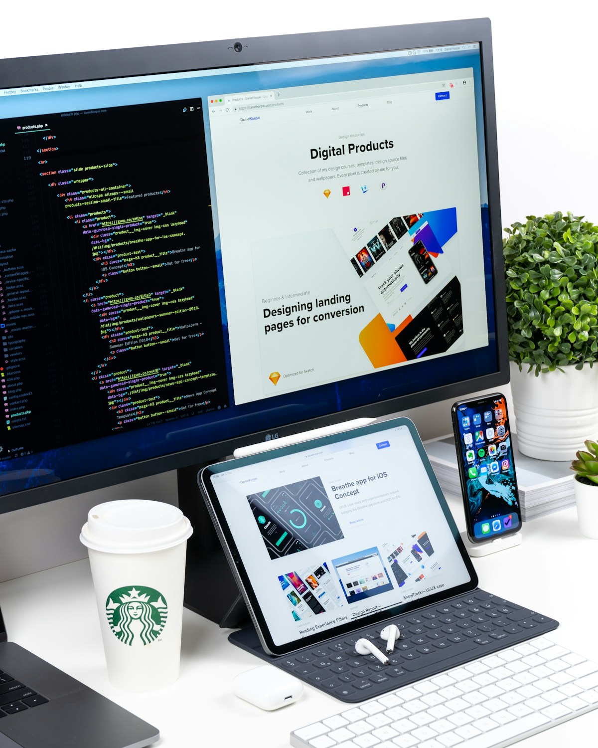
Responsive design means your website automatically adapts to any screen size – from large desktop monitors to small smartphone screens. Content reorganizes, images resize, and navigation adjusts to provide optimal viewing on every device.
Google Prioritizes Mobile-Friendly Sites
Google uses mobile-first indexing, meaning it primarily uses the mobile version of your site for ranking. Non-responsive websites rank lower in search results, reducing your visibility to potential customers searching for services in Kenya.
Better User Experience = More Conversions
Users abandon websites that are difficult to navigate on mobile. Responsive sites provide seamless experiences – easy reading, intuitive navigation, and simple forms. This translates directly to more inquiries, sales, and customer engagement.
Cost-Effective Solution
Instead of building separate mobile and desktop versions, responsive design uses one codebase that works everywhere. This reduces development costs and simplifies maintenance – update once, deploy everywhere.
Future-Proof Your Business
New devices with different screen sizes emerge constantly. Responsive design ensures your website works on devices that don't even exist yet. It's an investment in longevity and adaptability.
Key Elements of Responsive Design
- Flexible Grid Layouts: Content adjusts proportionally to screen size
- Fluid Images: Pictures scale within their containers
- Media Queries: CSS rules apply based on device characteristics
- Touch-Friendly Navigation: Buttons and links sized for fingers, not mice
- Readable Typography: Text remains legible without zooming
Testing Across Devices
Professional developers test on real devices popular in Kenya – from high-end Samsung Galaxy phones to affordable Tecno smartphones. This ensures your site works for all your potential customers, regardless of device.
Is Your Website Mobile-Friendly?
Green Editors specializes in responsive web design that looks stunning and performs perfectly on all devices. Let's rebuild your site for the mobile-first era.